
Crypto Exchange App
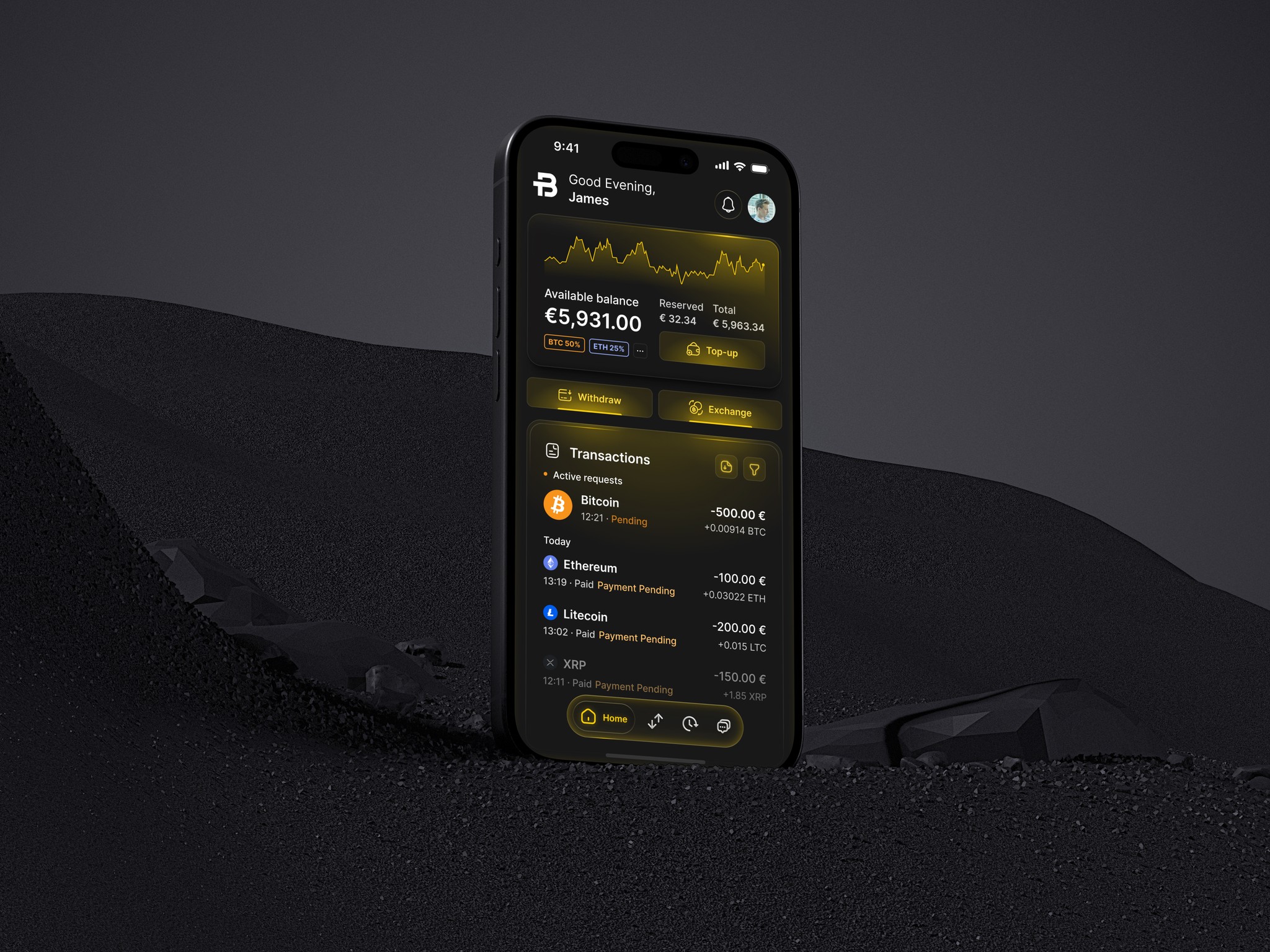
BTCBIT is a cryptocurrency exchange, offering a secure and reliable platform to buy and sell Bitcoin, Ethereum, Litecoin, and other popular cryptos.
Client
BTCBIT
Category
crypto
exchange
Date
Apr 29, 2025
Type
Mobile App


Disciplines
UX Strategy
Product Design
UX & Research
Figma Development (Figma Sites for Prototyping)
Generative AI
Design System
Challenge
Design a secure, intuitive, and compliant trading experience that balances simplicity with advanced functionality. The goal was to make crypto trading accessible to both beginners and professionals while ensuring full regulatory compliance, real-time performance, and seamless integration of multiple payment methods. All within a clean, scalable interface optimized for trust and ease of use.
Process
To design the BTCBIT mobile app experience, I started by identifying what users value most when managing their digital assets using the website. Their top concerns were clear:
Is my money and data secure?
How quickly can I buy or sell crypto?
Can I trust this platform with my identity and funds?
Strategic requirements
Nowadays, users are performing more quick buy/sell transactions on mobile than on the web.
BTCBIT needed a native mobile experience optimized for speed and ease of use, so the requirements were to:
Improve KYC completion rates with smoother mobile flows (web KYC drop-off can be high due to context switching, file upload friction)
Enable biometric login and secure local access.
Offer push-based transactional status feedback to improve perceived reliability (especially for pending transfers)
Competitive/Product advantages
A native mobile experience gives the product a stronger edge in user engagement, trust, and conversion efficiency compared to traditional solutions:
Mobile presence increases brand stickiness vs being “just another payment widget provider”
Faster time-to-action for recurring users → one-tap re-buy, saved methods, face ID auth
Access to native OS trust patterns (FaceID icon, secure PIN overlay) → subconsciously signals legitimacy vs. web-based players
Direct app = lower cognitive friction compared to the web (usually)
Information Architecture
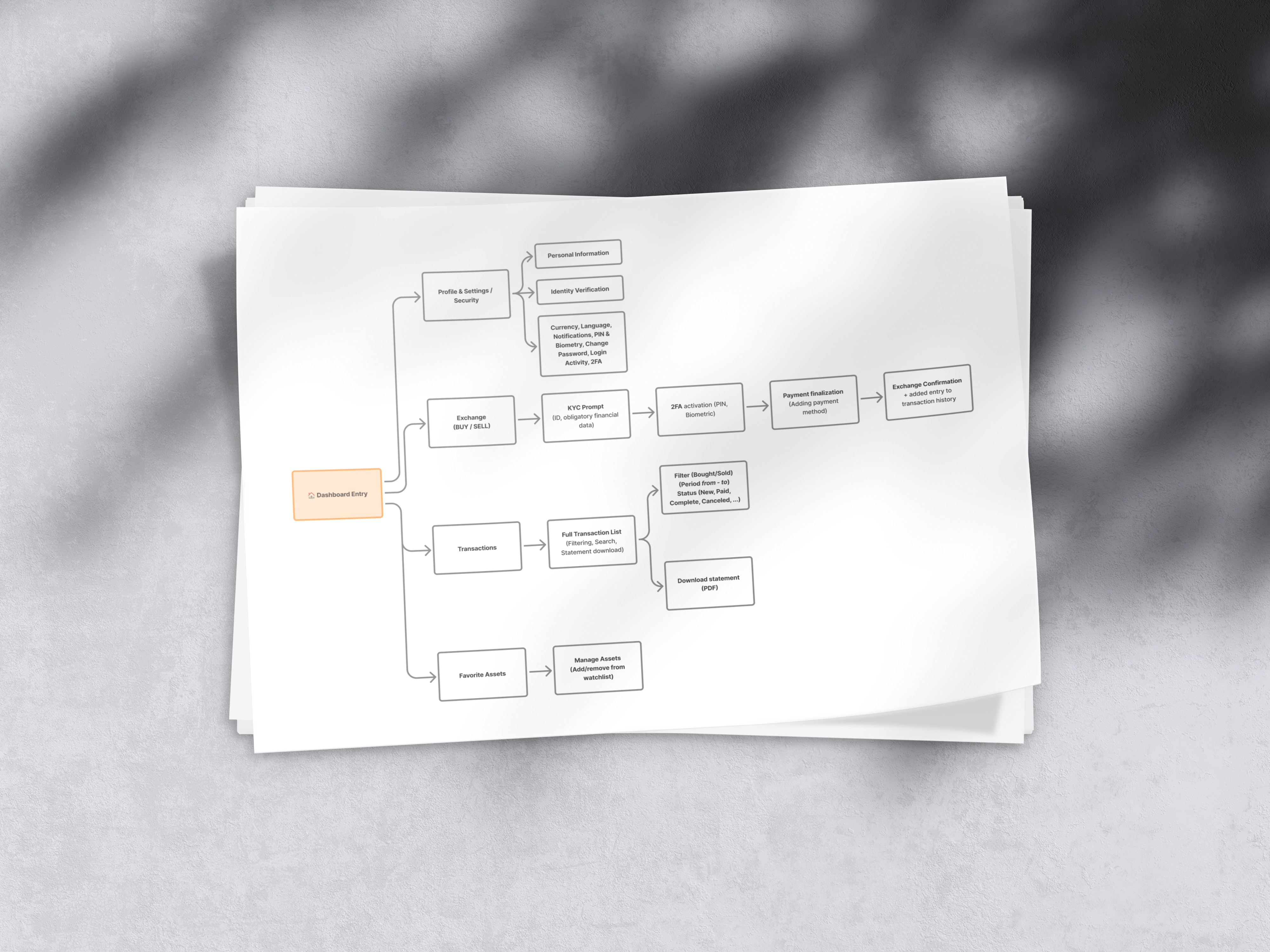
IA (Information Architecture) structure ensures all key exchange functions, profile management, transactions, and asset tracking are accessible through a centralized entry point in the product.
Clear hierarchy supports scalability for future functionality (e.g., staking, wallet analytics and more).
Step-based flows reflect compliance-first UX.
Consistent interaction patterns that aligns across web and mobile.
Key Wireframes
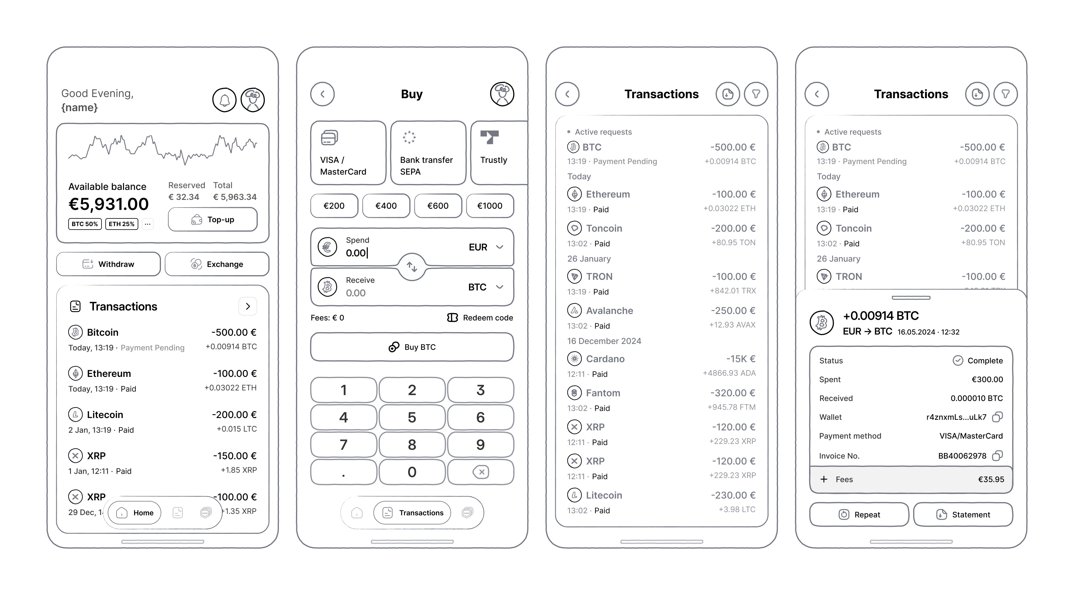
These wireframes form the first functional concept of the BTCBIT mobile app, defining layout logic, hierarchy, and exchange flow before applying visual direction.
Purpose
Validate core usability and compliance, giving users a clear overview of funds, quick exchange actions, and transparent transaction history.
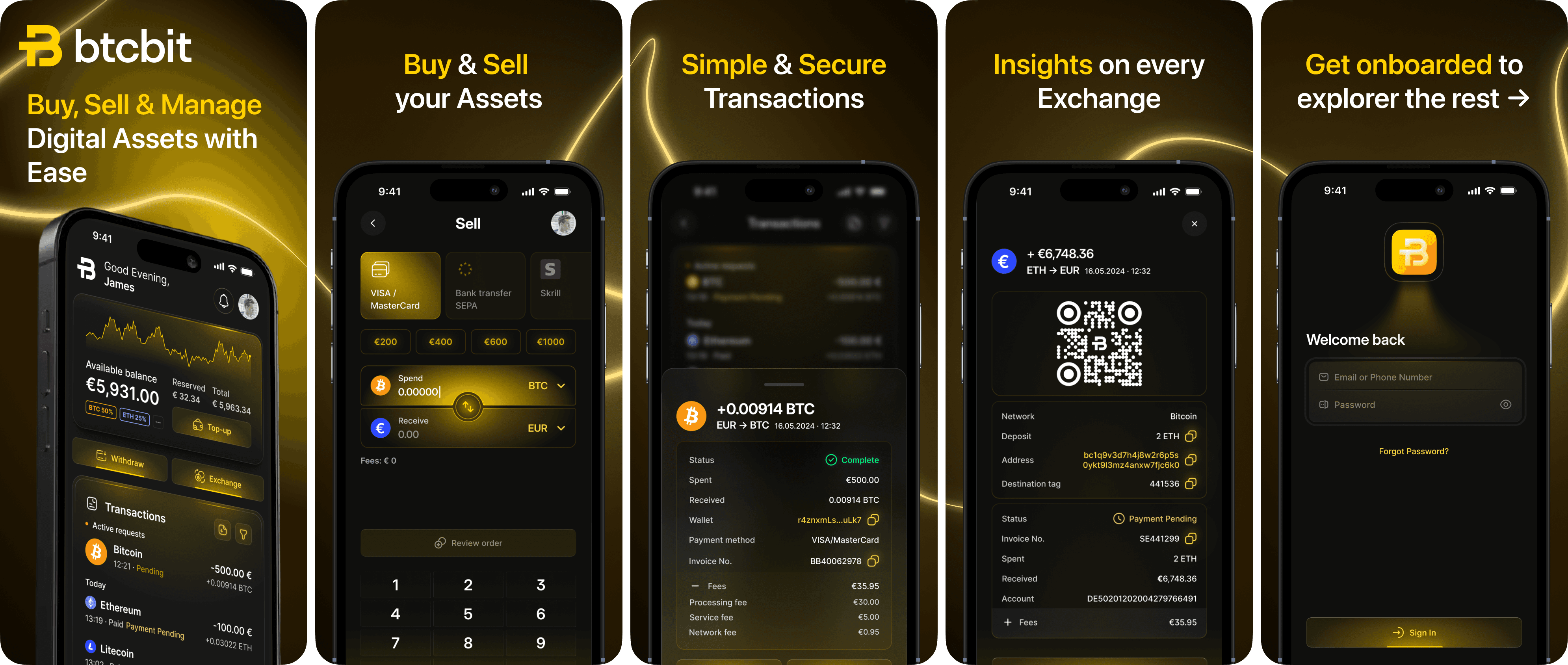
Dashboard: Central hub showing total balance, quick actions (Top-up, Withdraw, Exchange), and recent transactions for instant clarity.
Buy screen: Fast conversion between fiat and crypto with preset amounts and clear payment methods, built for simplicity and fee transparency.
Transactions: list showing asset, status, and amount.
Transaction details: Full breakdown (wallet, fees, method, invoice) ensuring accountability and audit access.
Moodboard

I set the tone for exploring a potential visual direction, combining elements of precision, depth, and understated luxury.
The dark palette, accented with golden light, creates an experience that feels both sophisticated and powerful, suitable for a high-trust digital product.
Each element captures a distinct aspect of the mood made to translate that into a design:
Golden data visuals: Clarity, accuracy, and motion. Impression of analytical precision.
Car shape and it's reflections: Control, performance, and the elegance of engineered design.
Fluid black materials hint at seamless flow and refinement in interaction.
Brushed metal and gold gradients bring a tactile sense of quality and reliability.
Intersecting light beams introduce a futuristic, energetic quality. Balancing warmth with innovation.
These visuals define a premium design atmosphere, One that merges the language of finance, technology, and craftsmanship into a bold identity yet to be shaped.
Design Direction & Exploration
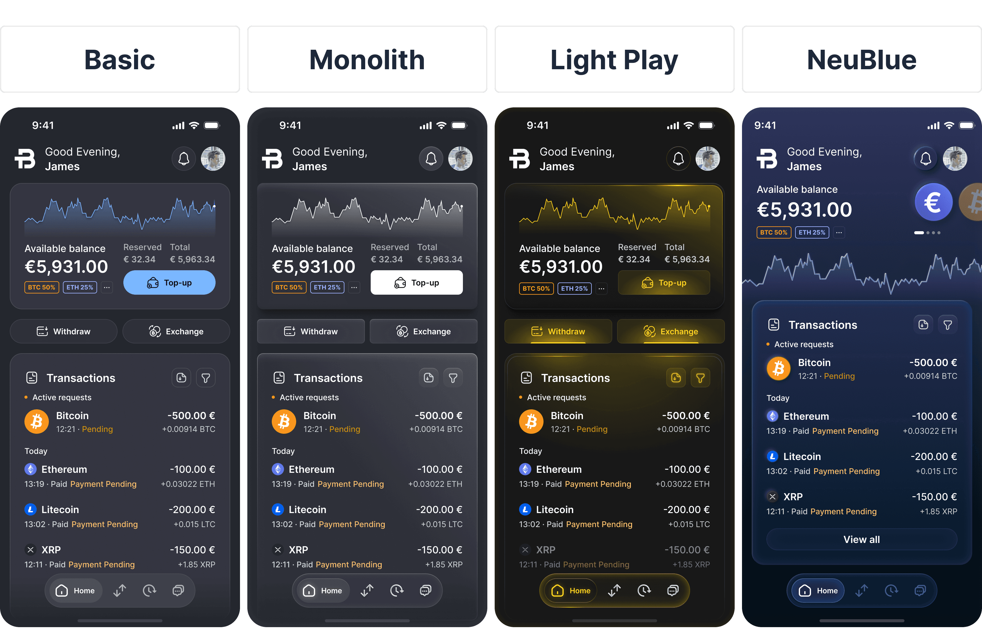
During the visual exploration phase, I created and tested four distinct design direction concepts: Basic, Monolith, Light Play, and NeuBlue, to identify the right balance between trust, modernity, and brand differentiation for the product. Although I primarily focused on mood board as a source of direction, some variants deviated from it.
Design direction challenges
Crypto apps risk feeling either too sterile (financial) or too flashy (tech), so we had to balance trust with playful appeal.
Maintaining hierarchy in dark mode: Ensuring readability, depth, and contrast without visual fatigue.
Merging BTCBIT’s signature gold accent with a dark environment without overpowering the UI.
Exploration summary
I explored several visual directions to define a design that balances trust, sophistication, and brand distinction within the crypto exchange space:
Basic: Minimal, functional, but lacked distinct brand identity.
Monolith: Strong structure, enterprise feel, but slightly cold and rigid.
NeuBlue: Elegant gradients and depth, but visually detached from BTCBIT’s gold-centric palette.
Light Play: Introduced soft gold illumination, creating warmth and focus while preserving clarity and trust.
Design Decision: Light Play
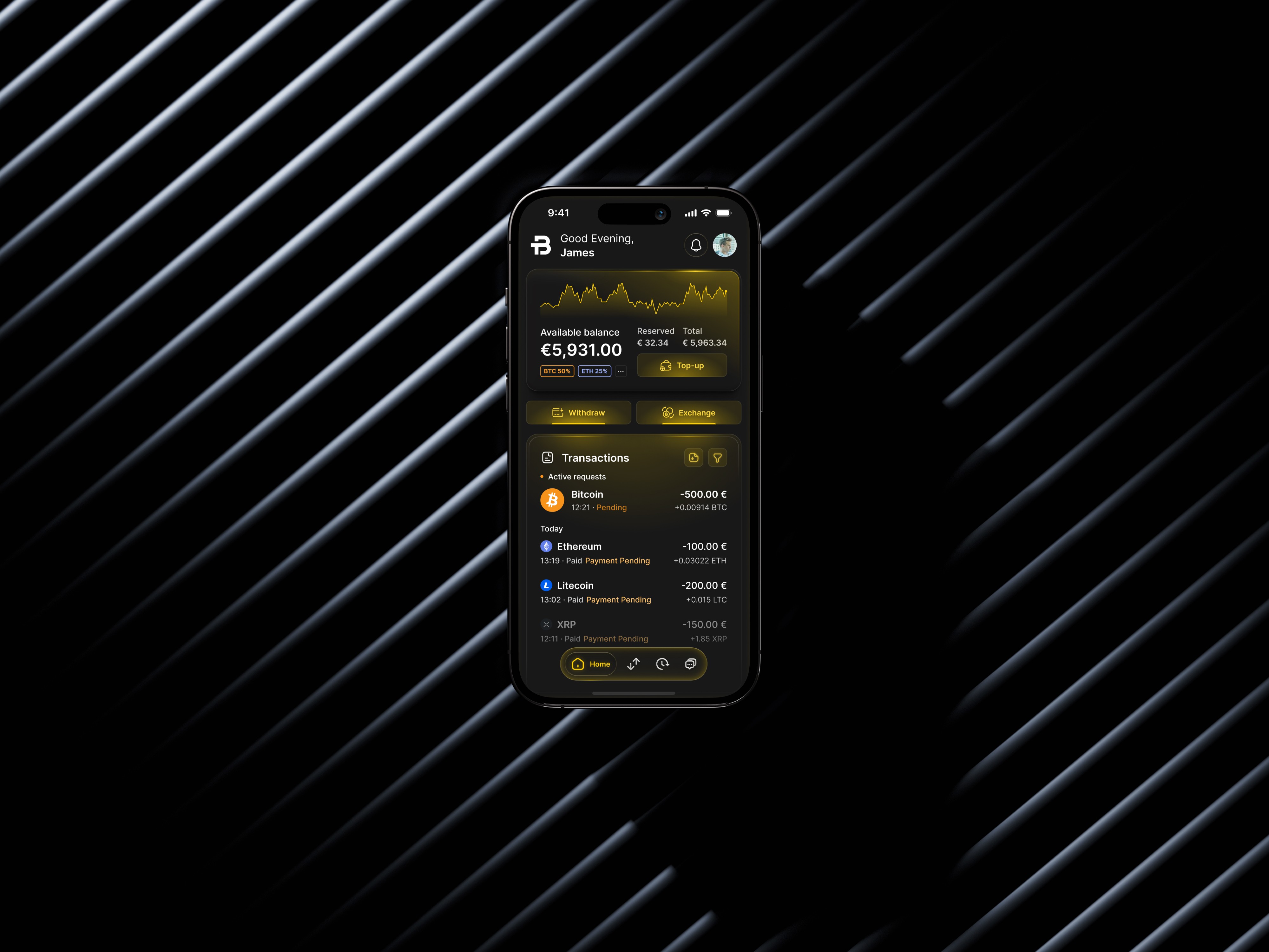
Chosen for its premium aesthetic that aligns with BTCBIT’s black-and-gold identity.
Clear visual hierarchy through lighting accents
Perceived depth and materiality
A polished, fintech-luxury sense of feeling suitable for both retail and institutional users
Defining Illustrations
Illustrations enhance clarity and emotion by visualizing abstractions, guiding, and voicing the brand tone. In empty states, they’re especially valuable by softening functional gaps and frictions, keeping users engaged, and turning “nothing to see” into a accessible, and instructive experience.
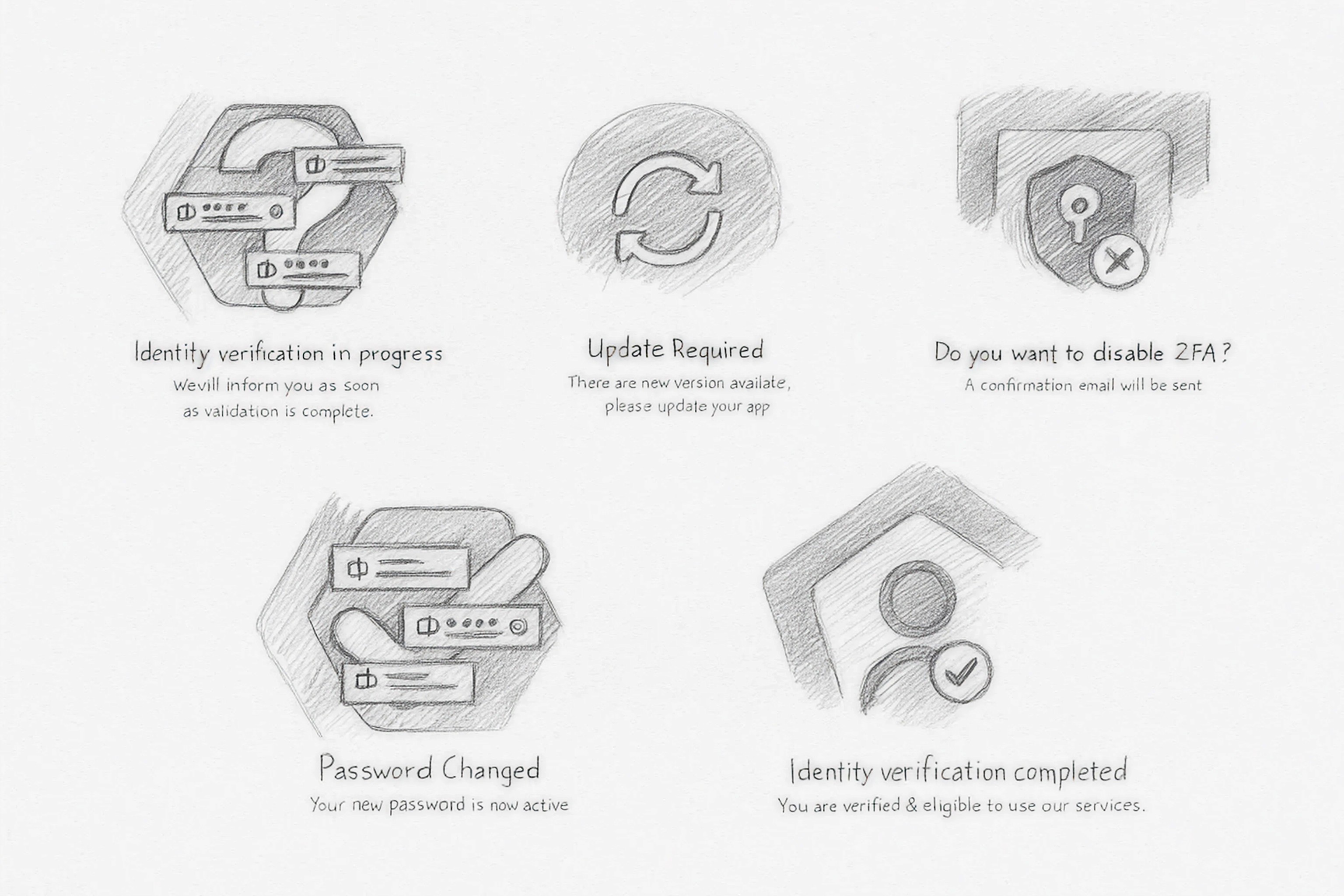
These were the main sketches I came up with that later got digitalized in Figma (see below)
Digitalized Result
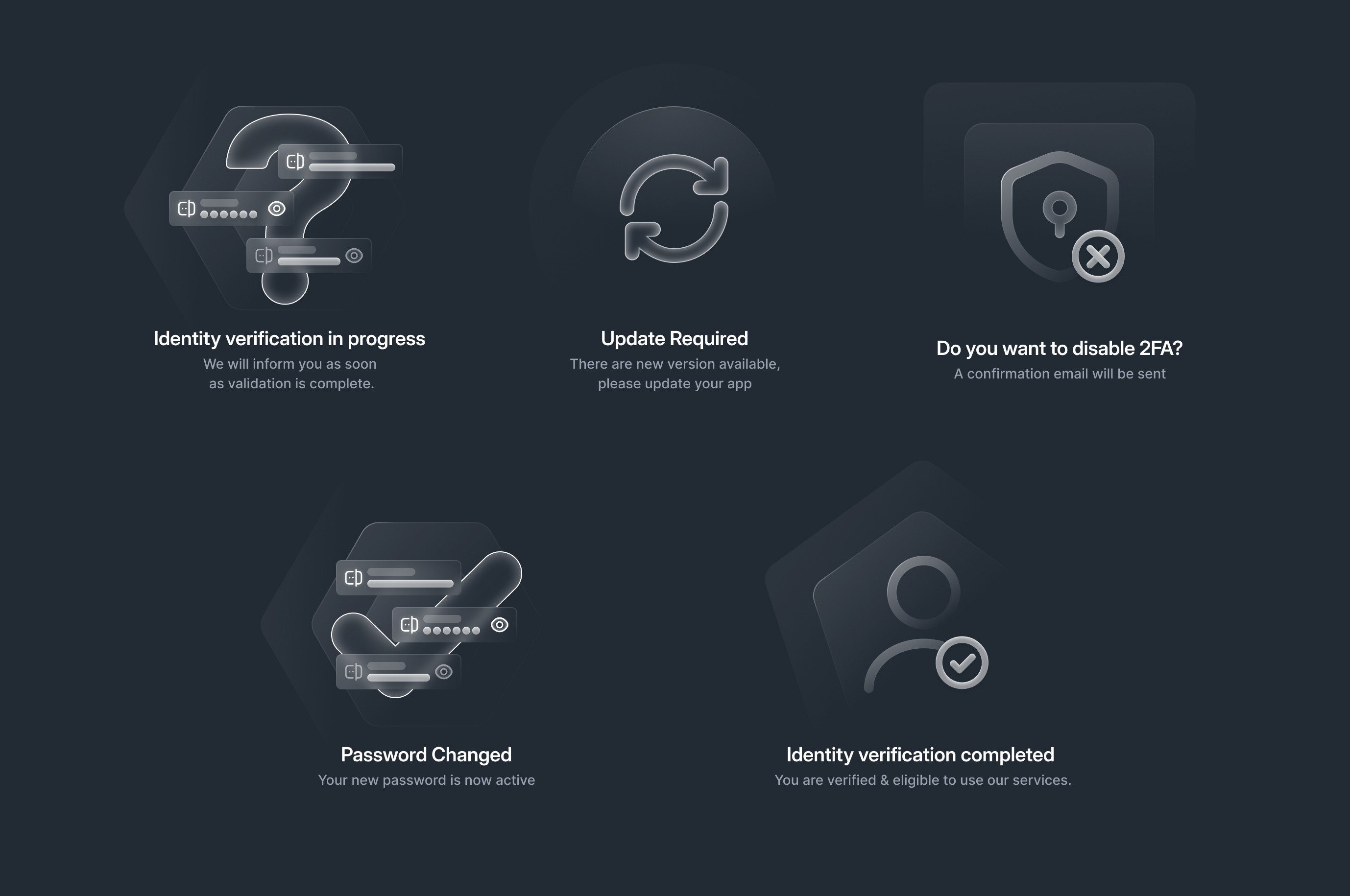
Production-ready illustrations; elegant, balanced, a premium experience.
Design System
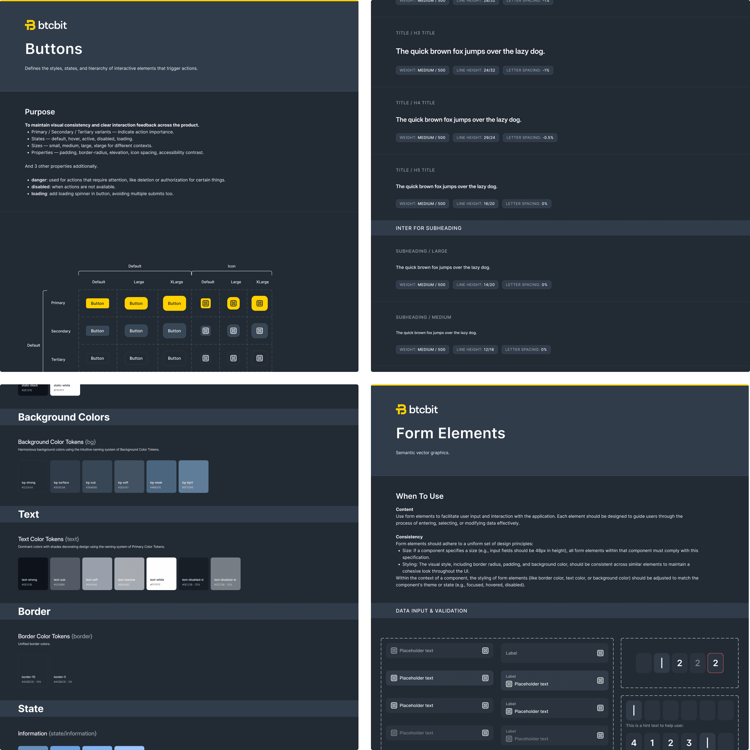
The BTCBIT Design System was built to bring consistency and efficiency to every part of the product.
It defines the brand, it's feeling, and behavior. From color, typography, and spacing to components, icons, and illustrations.
By unifying design and development, the team could move faster while keeping visual quality and accessibility intact.
Every element, from buttons to form elements, follows the same logic of structure and hierarchy, creating reliability and trust that’s essential for financial product.
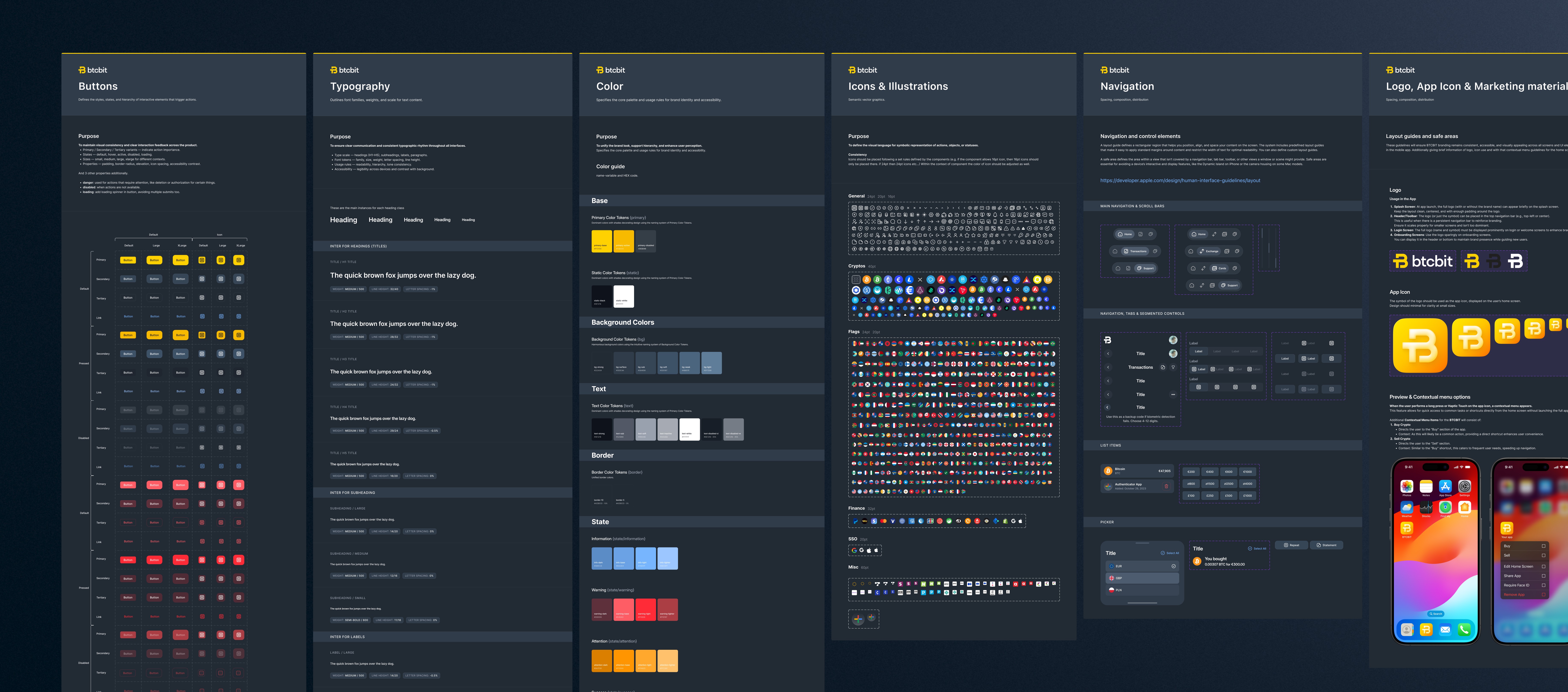
Beyond visuals, the system also shapes how the product communicates - through motion, tone, and interaction. In short, it’s not just a set of guidelines, but a foundation for BTCBIT’s design language, supporting future scalability across the entire product.
Result & Metrics
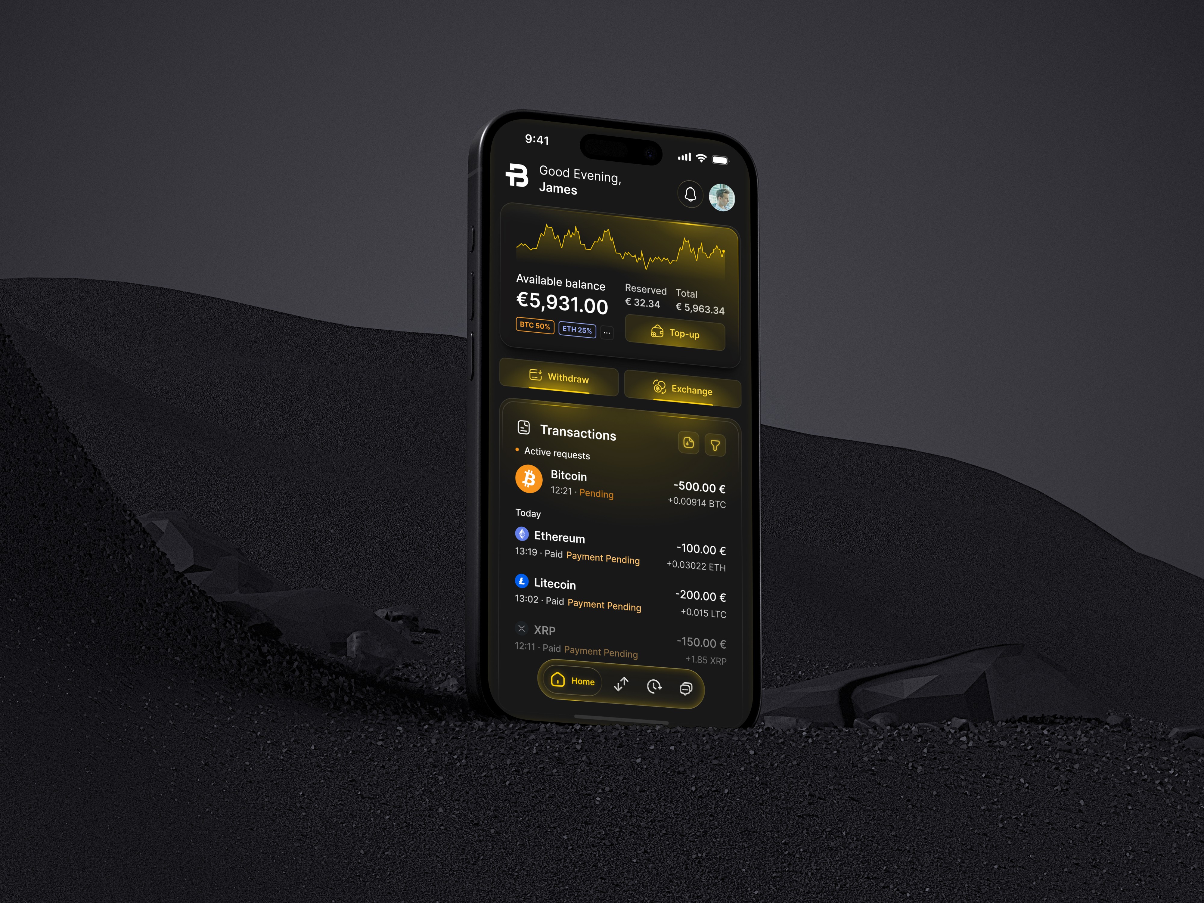
App experience centered around clarity, speed, and trust. A clean structure that organizes key functions: exchanging, wallets, and security, while intuitive UI patterns simplify complex crypto processes. Biometric login, frictionless KYC flows, and real-time transaction feedback that extends user needs. The scalable design system ensures visual consistency and flexibility for future features and product growth.
Impact & Metrics
After launch, the mobile app achieved:
21% higher daily active usage compared to the web platform.
25% increase in exchange transaction volume, driven by clearer visual hierarchy and smoother flows.
Session duration up by 28%, reflecting improved engagement and trust.
User retention +22% within the first 90 days, linked to more immersive, visually focused interactions.
Support tickets reduced by 35%, due to simplified navigation and more intuitive feedback states.
(Source: GA4, Amplitude, Hotjar, SQL)
Disciplines
UX Strategy
Product Design
UX & Research
Figma Development (Figma Sites for Prototyping)
Generative AI
Design System
Challenge
Design a secure, intuitive, and compliant trading experience that balances simplicity with advanced functionality. The goal was to make crypto trading accessible to both beginners and professionals while ensuring full regulatory compliance, real-time performance, and seamless integration of multiple payment methods. All within a clean, scalable interface optimized for trust and ease of use.
Process
To design the BTCBIT mobile app experience, I started by identifying what users value most when managing their digital assets using the website. Their top concerns were clear:
Is my money and data secure?
How quickly can I buy or sell crypto?
Can I trust this platform with my identity and funds?
Strategic requirements
Nowadays, users are performing more quick buy/sell transactions on mobile than on the web.
BTCBIT needed a native mobile experience optimized for speed and ease of use, so the requirements were to:
Improve KYC completion rates with smoother mobile flows (web KYC drop-off can be high due to context switching, file upload friction)
Enable biometric login and secure local access.
Offer push-based transactional status feedback to improve perceived reliability (especially for pending transfers)
Competitive/Product advantages
A native mobile experience gives the product a stronger edge in user engagement, trust, and conversion efficiency compared to traditional solutions:
Mobile presence increases brand stickiness vs being “just another payment widget provider”
Faster time-to-action for recurring users → one-tap re-buy, saved methods, face ID auth
Access to native OS trust patterns (FaceID icon, secure PIN overlay) → subconsciously signals legitimacy vs. web-based players
Direct app = lower cognitive friction compared to the web (usually)
Information Architecture

IA (Information Architecture) structure ensures all key exchange functions, profile management, transactions, and asset tracking are accessible through a centralized entry point in the product.
Clear hierarchy supports scalability for future functionality (e.g., staking, wallet analytics and more).
Step-based flows reflect compliance-first UX.
Consistent interaction patterns that aligns across web and mobile.
Key Wireframes

These wireframes form the first functional concept of the BTCBIT mobile app, defining layout logic, hierarchy, and exchange flow before applying visual direction.
Purpose
Validate core usability and compliance, giving users a clear overview of funds, quick exchange actions, and transparent transaction history.
Dashboard: Central hub showing total balance, quick actions (Top-up, Withdraw, Exchange), and recent transactions for instant clarity.
Buy screen: Fast conversion between fiat and crypto with preset amounts and clear payment methods, built for simplicity and fee transparency.
Transactions: list showing asset, status, and amount.
Transaction details: Full breakdown (wallet, fees, method, invoice) ensuring accountability and audit access.
Moodboard

I set the tone for exploring a potential visual direction, combining elements of precision, depth, and understated luxury.
The dark palette, accented with golden light, creates an experience that feels both sophisticated and powerful, suitable for a high-trust digital product.
Each element captures a distinct aspect of the mood made to translate that into a design:
Golden data visuals: Clarity, accuracy, and motion. Impression of analytical precision.
Car shape and it's reflections: Control, performance, and the elegance of engineered design.
Fluid black materials hint at seamless flow and refinement in interaction.
Brushed metal and gold gradients bring a tactile sense of quality and reliability.
Intersecting light beams introduce a futuristic, energetic quality. Balancing warmth with innovation.
These visuals define a premium design atmosphere, One that merges the language of finance, technology, and craftsmanship into a bold identity yet to be shaped.
Design Direction & Exploration

During the visual exploration phase, I created and tested four distinct design direction concepts: Basic, Monolith, Light Play, and NeuBlue, to identify the right balance between trust, modernity, and brand differentiation for the product. Although I primarily focused on mood board as a source of direction, some variants deviated from it.
Design direction challenges
Crypto apps risk feeling either too sterile (financial) or too flashy (tech), so we had to balance trust with playful appeal.
Maintaining hierarchy in dark mode: Ensuring readability, depth, and contrast without visual fatigue.
Merging BTCBIT’s signature gold accent with a dark environment without overpowering the UI.
Exploration summary
I explored several visual directions to define a design that balances trust, sophistication, and brand distinction within the crypto exchange space:
Basic: Minimal, functional, but lacked distinct brand identity.
Monolith: Strong structure, enterprise feel, but slightly cold and rigid.
NeuBlue: Elegant gradients and depth, but visually detached from BTCBIT’s gold-centric palette.
Light Play: Introduced soft gold illumination, creating warmth and focus while preserving clarity and trust.
Design Decision: Light Play

Chosen for its premium aesthetic that aligns with BTCBIT’s black-and-gold identity.
Clear visual hierarchy through lighting accents
Perceived depth and materiality
A polished, fintech-luxury sense of feeling suitable for both retail and institutional users
Defining Illustrations
Illustrations enhance clarity and emotion by visualizing abstractions, guiding, and voicing the brand tone. In empty states, they’re especially valuable by softening functional gaps and frictions, keeping users engaged, and turning “nothing to see” into a accessible, and instructive experience.

These were the main sketches I came up with that later got digitalized in Figma (see below)
Digitalized Result

Production-ready illustrations; elegant, balanced, a premium experience.
Design System

The BTCBIT Design System was built to bring consistency and efficiency to every part of the product.
It defines the brand, it's feeling, and behavior. From color, typography, and spacing to components, icons, and illustrations.
By unifying design and development, the team could move faster while keeping visual quality and accessibility intact.
Every element, from buttons to form elements, follows the same logic of structure and hierarchy, creating reliability and trust that’s essential for financial product.

Beyond visuals, the system also shapes how the product communicates - through motion, tone, and interaction. In short, it’s not just a set of guidelines, but a foundation for BTCBIT’s design language, supporting future scalability across the entire product.
Result & Metrics

App experience centered around clarity, speed, and trust. A clean structure that organizes key functions: exchanging, wallets, and security, while intuitive UI patterns simplify complex crypto processes. Biometric login, frictionless KYC flows, and real-time transaction feedback that extends user needs. The scalable design system ensures visual consistency and flexibility for future features and product growth.

Impact & Metrics
After launch, the mobile app achieved:
21% higher daily active usage compared to the web platform.
25% increase in exchange transaction volume, driven by clearer visual hierarchy and smoother flows.
Session duration up by 28%, reflecting improved engagement and trust.
User retention +22% within the first 90 days, linked to more immersive, visually focused interactions.
Support tickets reduced by 35%, due to simplified navigation and more intuitive feedback states.
(Source: GA4, Amplitude, Hotjar, SQL)


Other projects

Ubiquiti Inc. Community
Online platform where users, network administrators, and enthusiasts interact around Ubiquiti products like UniFi, UISP, AmpliFi, and EdgeMAX.
Client
Ubiquiti Inc
Date
Jan 3, 2024


Ubiquiti Inc. Community
Online platform where users, network administrators, and enthusiasts interact around Ubiquiti products like UniFi, UISP, AmpliFi, and EdgeMAX.
Client
Ubiquiti Inc
Date
Jan 3, 2024


Ubiquiti Inc. Community
Online platform where users, network administrators, and enthusiasts interact around Ubiquiti products like UniFi, UISP, AmpliFi, and EdgeMAX.
Client
Ubiquiti Inc
Date
Jan 3, 2024
