
Ubiquiti Community
Ubiquiti is an online platform where users, network administrators, and enthusiasts interact around Ubiquiti products like UniFi, UISP, AmpliFi.
Scope
End to end (information architecture, layout, visual system)
Stack
Figma, FigJam, Maze, Storybook, ChatGPT
Team
Project Manager, full-stack engineers, Head of Design, CEO
Timeline
~3 months of design; shipped in the fifth month

The problem
Ubiquiti's community ran on an old forum format that hadn't kept up with how people use communities now. Reddit and Discord had already shown people what a modern community feels like: easy to scan, easy to move around. Next to them, the forum felt dense and dated.
Two signals pushed in the same direction:
Users were saying so. There was feedback in the forum itself about how clunky it was to use.
Stakeholders wanted to rethink the whole thing, not just repaint it. The brief was to rebuild around what already works in the big modern communities, while keeping enough of the old forum that long-time members wouldn't feel lost.
The whole project came down to one tension: modernize enough to feel current without losing the power users who relied on the old density.
My role
I owned the full design scope, from information architecture and layout to interaction and the visual direction. The team around it stayed small, a PM, the full-stack developers, the Head of Design, and the CEO, and each milestone meant aligning direction with them.
There was already a design system to build on, with enough room to push the visuals and freshen things up. The system carried the consistency and reuse; the freedom went where it counted, so the result didn't land as just a recolor.
Approach
The starting point was to treat the best modern communities as patterns to learn from, not styling to lift. What makes Reddit easy to scan, why Discord feels light, and which of those ideas fit a support community where people show up to fix something specific.
The decision that mattered: density vs. legibility
The hardest call was how much to show at once. The old forum crammed in more threads per screen. It looked busy, but power users could take in a lot at a glance. The easy modern move, lots of white space and big cards, would look current while showing far less per screen, and for a support forum that's a real cost. People come here to get an answer quickly.
The first attempt: a three-density view (compact, medium, spacious) that let people pick their own. On paper it kept everyone happy: power users could stay dense, newer users could keep things calm.
Why it got cut: once it went in front of stakeholders, we agreed not to ship three modes. It added complexity to build and maintain, it split the visual language, and it asked users to make a choice most of them never would. The toggle was really a way of dodging a decision I hadn't made yet.
What shipped: one middle ground. Enough density to keep a useful number of topics on screen, with enough room to stay readable. Row height, type size, and divider weight all got tuned and re-tuned until the list held a good number of threads without feeling cramped.
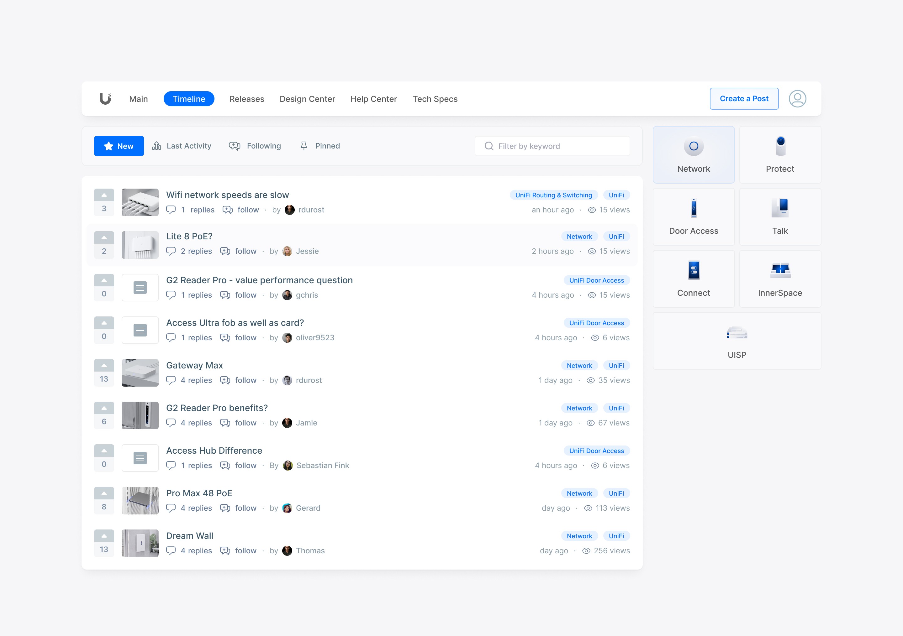
The shipped feed. Reddit-style voting and one toolbar (New, Last Activity, Following, Pinned) replace the old forum's scattered controls. The product switcher on the right keeps you moving between communities without leaving the page. The row spacing here is that middle ground.
The takeaway: reaching for a toggle is usually a sign you haven't picked a side yet. Committing to one good default was the harder call, and the right one.
Building the system
The redesign runs on three views, all built from the same system: the Main overview, the Timeline feed (above), and the thread view where the conversations happen. The real constraint was making one system hold up across all three, from a glanceable overview card down to a dense thread with a reply composer.
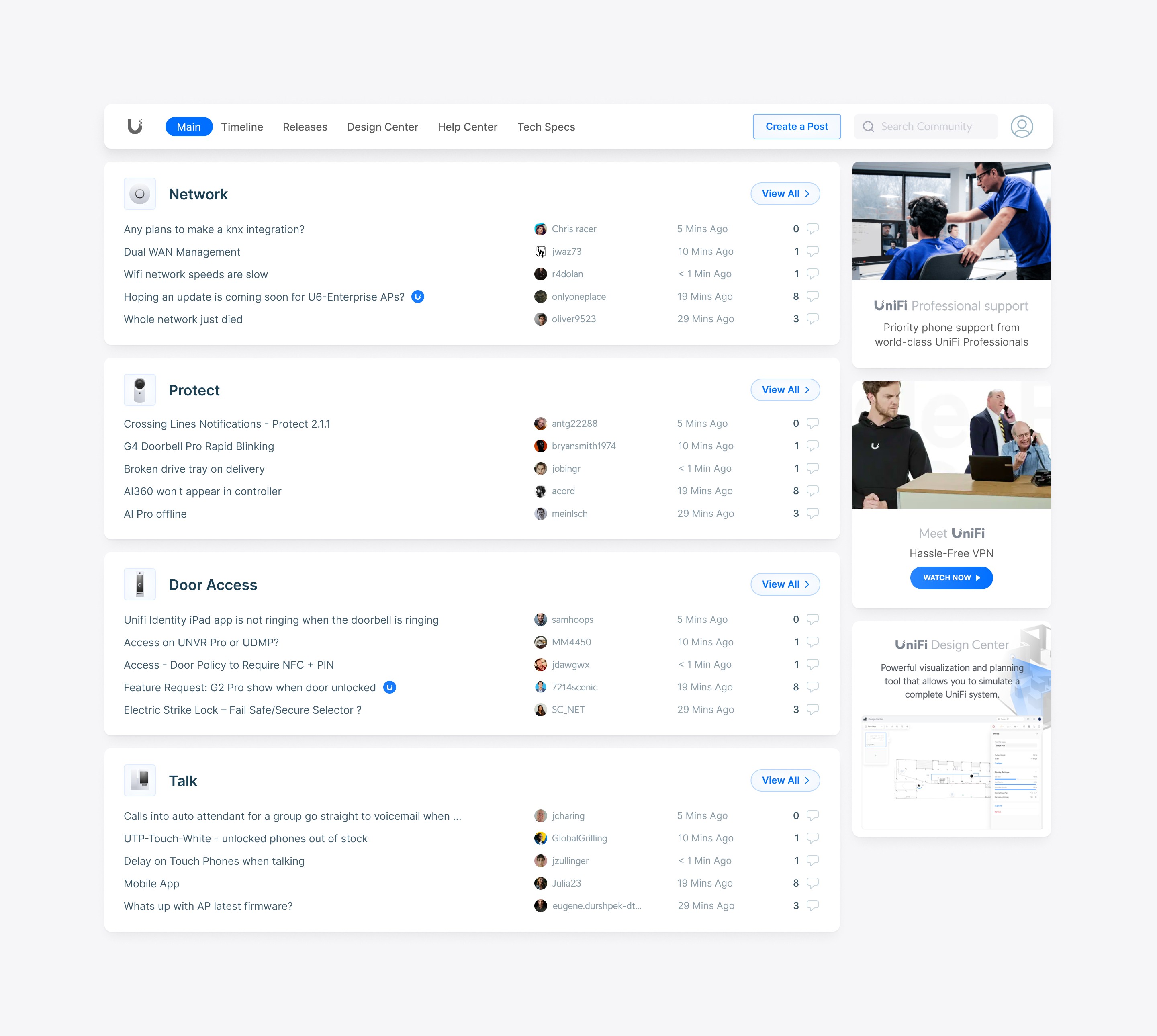
The Main overview. Live discussions grouped by product community (Network, Protect, Door Access, Talk), each one easy to scan with a View All into the full feed. Every section uses the same grid, so adding a new product community doesn't mean redesigning anything.
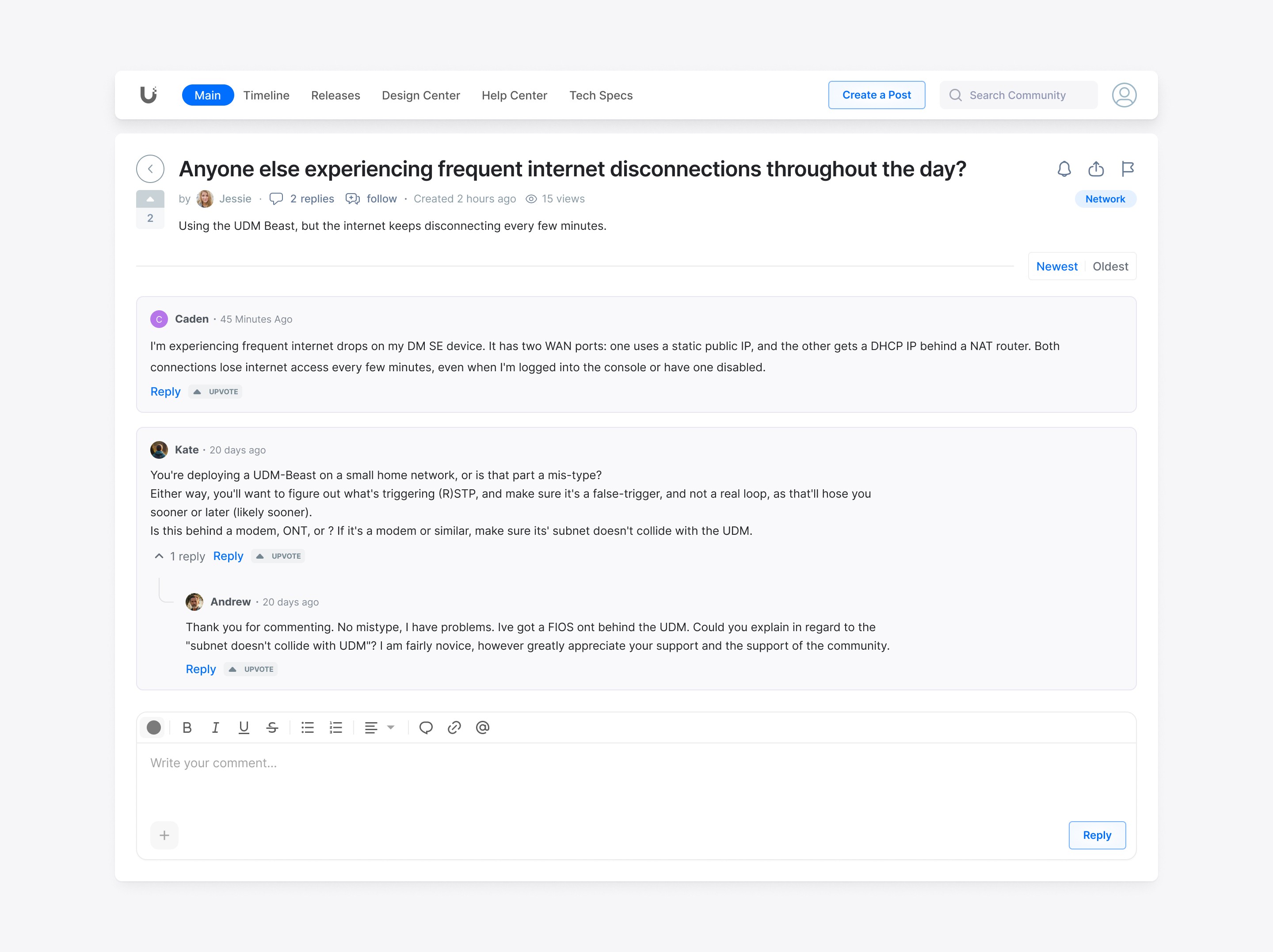
The thread view. Where a support community does its real work. Per-reply voting pushes the best answer to the top, replies nest one level so multi-person threads stay readable, and the composer handles formatting, mentions, and attachments so people can write a useful reply: steps, a config detail, a screenshot.
The rest was system work:
Simplified the components. The old list rows were a mix of icon styles, colored badges, and hover borders. They became uniform thread cards with light dividers and consistent states.
Pulled blue back to an accent. Instead of brand blue covering everything, the canvas is neutral and blue only marks actions and active states. The hover, selected, and active states all needed reworking so nothing lost its affordance on the quieter background.
Kept controls where people read. Voting, the sort toolbar, tag chips, and the product switcher all sit in the reading area, tuned to help without taking over.
Built it to scale. Every thread, tile, and filter follows the same grid, so the system stretches to new communities instead of being rebuilt each time.
Outcome
After launch we compared Google Analytics from before and after. Community engagement, meaning active users, posts, and replies, rose by about 23%. Stakeholders were happy with the direction and shipped it, and the system became the starting point for other Ubiquiti product communities.
(Some internal specifics are omitted under confidentiality.)
The problem
Ubiquiti's community ran on an old forum format that hadn't kept up with how people use communities now. Reddit and Discord had already shown people what a modern community feels like: easy to scan, easy to move around. Next to them, the forum felt dense and dated.
Two signals pushed in the same direction:
Users were saying so. There was feedback in the forum itself about how clunky it was to use.
Stakeholders wanted to rethink the whole thing, not just repaint it. The brief was to rebuild around what already works in the big modern communities, while keeping enough of the old forum that long-time members wouldn't feel lost.
The whole project came down to one tension: modernize enough to feel current without losing the power users who relied on the old density.
My role
I owned the full design scope, from information architecture and layout to interaction and the visual direction. The team around it stayed small, a PM, the full-stack developers, the Head of Design, and the CEO, and each milestone meant aligning direction with them.
There was already a design system to build on, with enough room to push the visuals and freshen things up. The system carried the consistency and reuse; the freedom went where it counted, so the result didn't land as just a recolor.
Approach
The starting point was to treat the best modern communities as patterns to learn from, not styling to lift. What makes Reddit easy to scan, why Discord feels light, and which of those ideas fit a support community where people show up to fix something specific.
The decision that mattered: density vs. legibility
The hardest call was how much to show at once. The old forum crammed in more threads per screen. It looked busy, but power users could take in a lot at a glance. The easy modern move, lots of white space and big cards, would look current while showing far less per screen, and for a support forum that's a real cost. People come here to get an answer quickly.
The first attempt: a three-density view (compact, medium, spacious) that let people pick their own. On paper it kept everyone happy: power users could stay dense, newer users could keep things calm.
Why it got cut: once it went in front of stakeholders, we agreed not to ship three modes. It added complexity to build and maintain, it split the visual language, and it asked users to make a choice most of them never would. The toggle was really a way of dodging a decision I hadn't made yet.
What shipped: one middle ground. Enough density to keep a useful number of topics on screen, with enough room to stay readable. Row height, type size, and divider weight all got tuned and re-tuned until the list held a good number of threads without feeling cramped.
The shipped feed. Reddit-style voting and one toolbar (New, Last Activity, Following, Pinned) replace the old forum's scattered controls. The product switcher on the right keeps you moving between communities without leaving the page. The row spacing here is that middle ground.
The takeaway: reaching for a toggle is usually a sign you haven't picked a side yet. Committing to one good default was the harder call, and the right one.
Building the system
The redesign runs on three views, all built from the same system: the Main overview, the Timeline feed (above), and the thread view where the conversations happen. The real constraint was making one system hold up across all three, from a glanceable overview card down to a dense thread with a reply composer.
The Main overview. Live discussions grouped by product community (Network, Protect, Door Access, Talk), each one easy to scan with a View All into the full feed. Every section uses the same grid, so adding a new product community doesn't mean redesigning anything.
The thread view. Where a support community does its real work. Per-reply voting pushes the best answer to the top, replies nest one level so multi-person threads stay readable, and the composer handles formatting, mentions, and attachments so people can write a useful reply: steps, a config detail, a screenshot.
The rest was system work:
Simplified the components. The old list rows were a mix of icon styles, colored badges, and hover borders. They became uniform thread cards with light dividers and consistent states.
Pulled blue back to an accent. Instead of brand blue covering everything, the canvas is neutral and blue only marks actions and active states. The hover, selected, and active states all needed reworking so nothing lost its affordance on the quieter background.
Kept controls where people read. Voting, the sort toolbar, tag chips, and the product switcher all sit in the reading area, tuned to help without taking over.
Built it to scale. Every thread, tile, and filter follows the same grid, so the system stretches to new communities instead of being rebuilt each time.
Outcome
After launch we compared Google Analytics from before and after. Community engagement, meaning active users, posts, and replies, rose by about 23%. Stakeholders were happy with the direction and shipped it, and the system became the starting point for other Ubiquiti product communities.
(Some internal specifics are omitted under confidentiality.)


Other projects

AI Copilot for a Crypto Exchange
Designing the UX layer between an LLM and irreversible transactions
Scope
Visual direction, information architecture, branding
Stack
Figma, FigJam, Maze, Claude

AI Copilot for a Crypto Exchange
Designing the UX layer between an LLM and irreversible transactions
Scope
Visual direction, information architecture, branding
Stack
Figma, FigJam, Maze, Claude
AI Copilot for a Crypto Exchange
Designing the UX layer between an LLM and irreversible transactions
Scope
Visual direction, information architecture, branding
Stack
Figma, FigJam, Maze, Claude

BTCBIT Crypto Exchange
A cryptocurrency exchange, offering a secure and reliable way to buy and sell Bitcoin, Ethereum, Litecoin, and other popular cryptos.
Scope
Visual direction, information architecture, branding
Stack
Figma, FigJam, Maze, Claude
BTCBIT Crypto Exchange
A cryptocurrency exchange, offering a secure and reliable way to buy and sell Bitcoin, Ethereum, Litecoin, and other popular cryptos.
Scope
Visual direction, information architecture, branding
Stack
Figma, FigJam, Maze, Claude
BTCBIT Crypto Exchange
A cryptocurrency exchange, offering a secure and reliable way to buy and sell Bitcoin, Ethereum, Litecoin, and other popular cryptos.
Scope
Visual direction, information architecture, branding
Stack
Figma, FigJam, Maze, Claude